
The Café Wall Illusion: Why Parallel Lines Look Tilted
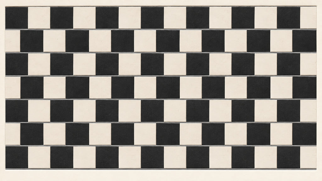
The café wall illusion makes parallel horizontal lines look as though they slope toward or away from one another. Alternating light and dark tiles, shifted between rows and separated by narrow mortar bands, create the misleading appearance. The apparent wedges belong to perception; they do not require a wedge-shaped wall.
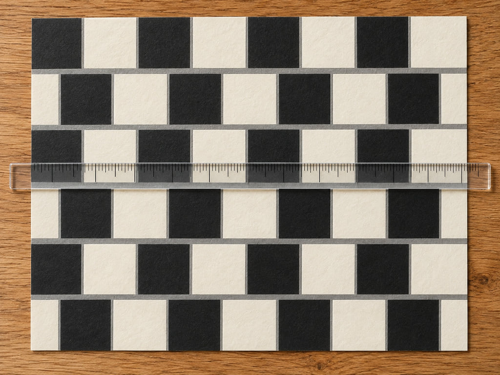
Look at the flat example below, then check one of its gray bands against a straight edge. That comparison is the point of this guide: separate what the pattern seems to do from the geometry you can verify. The ceramic and ruler pictures provide context; the HTML example supplies the straight boundaries for the check.
Parallel lines can look like wedges
Let your gaze take in the whole rectangle before tracing an individual line. You may notice neighboring rows appearing to lean in opposite directions. Now follow a single gray band from left to right. The design does not contain a hidden bend or a narrowing row. Each tile row has the same height, and every separating border runs horizontally.
Flat example: each row is 40 CSS pixels high, with a 3-pixel gray border below it. The pattern repeats every 80 pixels, and alternate rows shift by 40 pixels. These are the dimensions of this example, not measurements of the historic café wall or a claim about the strongest possible effect.
The useful comparison is between the repeating pattern and one isolated boundary. Cover the tiles above and below a band with two pieces of paper, leaving a narrow horizontal opening. Compare the exposed line with the paper's edge. Then uncover the pattern. You are changing the visible context while leaving the line's position unchanged.
The Bristol café and Richard Gregory
The name comes from a real tiled café frontage in Bristol, England. A University of Bristol account connects Richard Gregory's rediscovery of the effect with a café at the bottom of St Michael's Hill. It describes the original tiles as green and cream, so black and white are a demonstration choice rather than the only colors associated with the story.
The same account describes Gregory building a sliding chessboard model to investigate the pattern. Adding a strip between its rows produced the wedge effect. This makes the story useful beyond the location: the space between rows was part of the phenomenon he needed to reproduce. The university calls it a rediscovery, which is a better description than crediting the first observation of every related pattern to Gregory.
Gregory and Priscilla Heard published “Border locking and the Cafe Wall illusion” in 1979. Their paper examined how changes to the display affected its appearance. The café gives the effect a memorable name; controlled patterns let researchers vary individual features.
| Reference | What it establishes | How to use it |
|---|---|---|
| Bristol café | A real setting linked to the name | Historical context |
| Gregory and Heard, 1979 | Experimental study of the pattern | Conditions affecting the effect |
| Flat example above | A specified arrangement of rows and borders | A geometry check on this page |
Tiles, offsets, and mortar contrast
Start with three features: alternating light and dark squares, a sideways shift between neighboring rows, and thin separating bands. An ordinary aligned checkerboard is a different arrangement. The stagger matters because each stretch of mortar has different combinations of light and dark tiles above and below it.
Gregory and Heard reported that the effect depends strongly on the contrast between tiles and on the mortar's width and luminance, or measured brightness. Mortar with a luminance between the dark and light tiles provides a useful demonstration. Very wide bands or mortar far outside that brightness range can weaken or remove the characteristic distortion. A visible gray gap is part of the stimulus, not an incidental outline.
For an approachable explanation, think of the border as being seen together with its neighboring edges. A model by Nasim Nematzadeh and David M. W. Powers analyzes the pattern with filters at multiple scales. Its edge maps reveal tilt cues even though the input mortar lines are horizontal. That is a proposed computational account of how local image structure can lead to a larger apparent tilt, rather than evidence that the image itself has tilted.
The practical lesson is to change one ingredient at a time. If you make a paper version, keep the squares and row positions fixed while trying a different gap width. If you then change both the offset and the colors, you have a new comparison with several possible causes. Keep your observations separate from any claim about what every viewer will see.
Verify parallelism with a ruler
Use the HTML rectangle for this check. A photograph can introduce perspective, and a textured tile picture may contain small irregularities. Neither makes a good substitute for a flat stimulus whose layout is specified. Keep the page still while checking, and use a clean straight edge without pressing on or scratching your screen.
- Choose one gray horizontal band near the middle of the rectangle.
- Hold a straight edge alongside it, leaving the band visible rather than covering it.
- Compare the separation near the left, center, and right of the rectangle.
- Repeat with the next band. The reference should stay aligned without requiring a different angle.
- Remove the edge and view the whole pattern again.
For a digital check, open browser developer tools and inspect the tile rows. Equal heights and horizontal borders establish their layout. A screenshot can also be checked by comparing the vertical coordinates of a band's center at several horizontal positions. Allow for edge smoothing when identifying individual pixels; choose the same part of the band each time.
Keep the two conclusions distinct. Geometry tells you whether the boundaries are parallel. Your observation tells you how the pattern appears under your viewing conditions. You do not have to report a particular strength of illusion to complete the geometry check, and a ruler does not measure the size of the perceived effect.
How this differs from the checker shadow illusion
In the café wall pattern, the question concerns apparent orientation. In Edward Adelson's checker shadow illusion, two squares labeled A and B have the same gray value while appearing different. That comparison concerns lightness in context. It is not a test of whether a mortar line is horizontal.
MIT's explanation discusses local contrast and the visual system's treatment of shadows. To check that image, compare the squares' actual color values or use Adelson's connecting-stripe demonstration. Putting a ruler along a square does not answer the lightness question. Match the tool to the property you are investigating.
Our guide to optical illusions and what you can measure places examples in a wider context. For this pattern, try one simple sequence: view the complete rectangle, isolate a gray border, check its position, and uncover the tiles again. The interesting result is that knowing the layout and seeing the layout can remain different experiences.
Frequently Asked Questions
Are the mortar lines actually tilted?
In a correctly constructed café wall stimulus, the horizontal mortar bands are straight and parallel. The HTML sample on this page uses equal-height rows separated by horizontal borders. The surrounding tile pattern can make those bands appear tilted. Check several points along one border with a straightedge; a genuinely crooked line would be a different case.
Why do the gaps between tiles matter?
The gaps introduce narrow bands whose brightness interacts with the neighboring light and dark tiles. Gregory and Heard found that mortar width and luminance strongly affect the illusion. Intermediate gray mortar between contrasting tiles is a useful starting point. Removing the gaps, widening them, or changing their brightness changes the stimulus rather than simply decorating it.